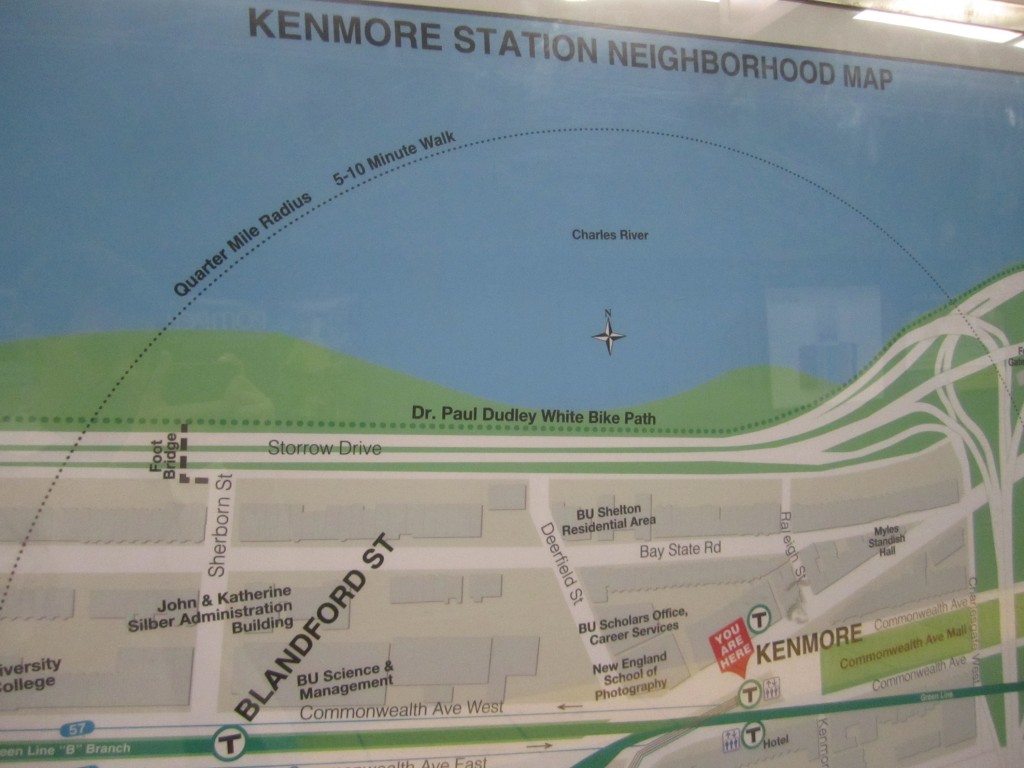
From Kenmore Station, an MBTA T stop, in Boston:

Do you see that rather large chunk of blue? That is a river, you cannot walk in it. Okay, fine, drawing a circle is easier than drawing 70% of a circle and cutting it off at certain points but not that much easier. If someone is going through the trouble of commissioning someone to design this, can’t they have that person spend the extra 5 minutes to make this otherwise very realistic map make total sense? Maybe it was some contracted graphic designer that was trying to milk an extra $100 a map out of the MBTA for fixing the circles and they decided it was worth saving the money. It’s the little things that I spend way too much time thinking about.
